Be Clear in a Split Second
When it comes to your website first impression, let’s be honest: you’re not competing with your competitors. You’re competing with the back button.
In 2025, attention is a currency no one holds for long. Users scroll faster than you can type “synergistic solutions,” and unless you’ve made them care immediately, they’re gone—off to Slack, Spotify, or another site that didn’t make them think so hard.
You have a split second.
Not to be clever. Not to be creative.
But to be clear.
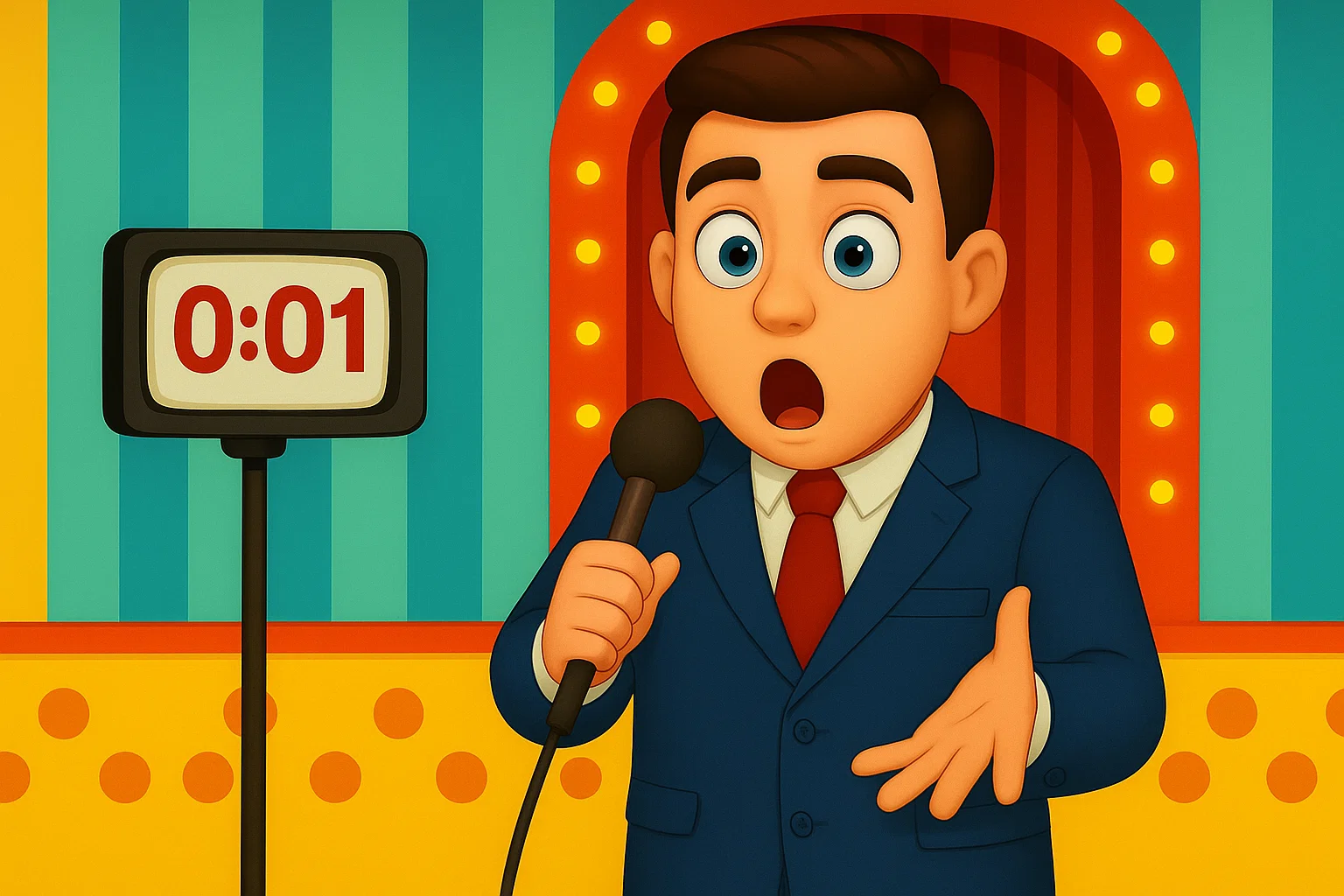
🧠 The Psychology of the Split Second
According to research, visitors form a website first impression in under 50 milliseconds. That’s less time than it takes to blink—literally. And what’s more, 79% of users bounce if they don’t understand what you offer or why it matters.
This isn’t a UX insight. It’s a neurological fact: humans make snap decisions based on visual clarity, perceived relevance, and emotional resonance. If your homepage opens with a vague tagline and an artsy hero shot of someone looking thoughtfully into the distance, you’ve already lost them.
🚫 Don’t Be Clever, Be Clear
Your homepage must win the website first impression in under 1.5 seconds—or you’ll lose them.
We’ve seen it all before:
Clever kills clarity. And clarity is what converts. “Empowering scalable impact through transformative ecosystems.”
What does that mean? Who’s it for? Why should I care?
Compare that with: “Automated reporting for healthcare teams. Share insights faster. Improve patient outcomes.”
Boom. Clarity. Relevance. Value. In 1.5 seconds.
At Produktiv, we always start with the same brutal question:
What do you do, and who gives a damn?
If you can’t answer that above the fold, your homepage isn’t a homepage—it’s a leak.
Your above-the-fold section is your spotlight moment—your first and only chance to keep someone from bouncing. It should include:
- What you are (e.g., “A product analytics tool”)
- Who it’s for (e.g., “Designed for product teams at SaaS startups”)
- Why it matters (e.g., “So you can ship faster, with confidence”)
- And a CTA (not “Learn More”—actually tell them what they’re getting)
Scroll is earned. Clarity is the currency.
🧱 How We Do It At Produktiv
Every project starts with one goal: nail the website first impression before we ever think about colors or fonts.
Every layout, every line of copy is built to create a strong website first impression—because that’s what drives engagement.
Analance
Take Analance—a data analytics platform that was drowning in jargon. We rebuilt it around a single idea: give product and marketing teams clear insights, fast. No cleverness. Just clarity that clicks.
Koorier
Or Koorier: a same-day delivery brand trying to look and sound like an industry leader. We wrote and designed the homepage to do one thing: say what they do, who they do it for, and why it’s better—before a visitor could even blink.
Oneday
Oneday is another example. Their hero section doesn’t dance around. It leads with “Life Insurance at its purest,” backed by a CTA that actually means something.
🔁 Copy Before Design—Every Time
Design supports clarity. Not the other way around.
At Produktiv, we lead every website with copy. It tells the story, sets the structure, and gives the designer constraints that convert. We build with low-code tools that let you adjust in real-time, test language, and adapt fast—because your business evolves faster than your Figma file.
🎯 Bottom Line
Your website isn’t your brand.
It’s not your moodboard.
It’s your #1 communicator.
So treat it like the opening pitch that wins the website first impression. Because before anyone clicks “Book a Demo,” they’ll ask:
“Do I get this?”
“Is this for me?”
“Why should I care?”Answer those in your first second—and you’ll get the next.
Make Your Brand Think Before It Shouts
If you’ve made it this far, you already know: good branding isn’t about being loud—it’s about being unmistakable. So why stop at theory? Download our free Brand & Website Strategy Framework—the same tools we use to shape brand voices, untangle messy messaging, and help teams sound like they actually know what they’re doing.
Inside: workshop templates, comms strategy guides, and just enough structure to keep things smart (without killing the fun).
Want a better website first impression? Start with sharp messaging above the fold.
→ Download the Brand & Website Framework
Make your brand as sharp as your best idea.
Want to see what clarity looks like in action? Check out our Product-Led Websites that Convert — built to win the website first impression from the very first scroll.
Written by Nicholas, Brand Strategist at Produktiv.

