New to the world of UX design? In that case, you might have come across the term, ‘wireframes’. If not, maybe it’s time you get yourself familiar with what it is. Because wireframing is the backbone of the UX design process. Its goal is to help you explore the best possible journey to creating a pixel-perfect interface.
Let us kick things off by getting down to its textbook definition, why it matters in the product design process and what features it includes. As you read further, we’ve also explained the various types of wireframes, the tools designers use to create them and some relevant examples to see what they look like in the real world.
A quick summary of what we’ve included in this blog post:
Wireframing and what it means?
When do designers create a wireframe?
Why is it important to create a wireframe?
Different types of wireframes
What features are included in a wireframe?
Tools and the process
Produktiv wireframe examples
Ready to dive deeper into the wonderful world of wireframing? Strap in, and let’s go!
Wireframing and what it means?
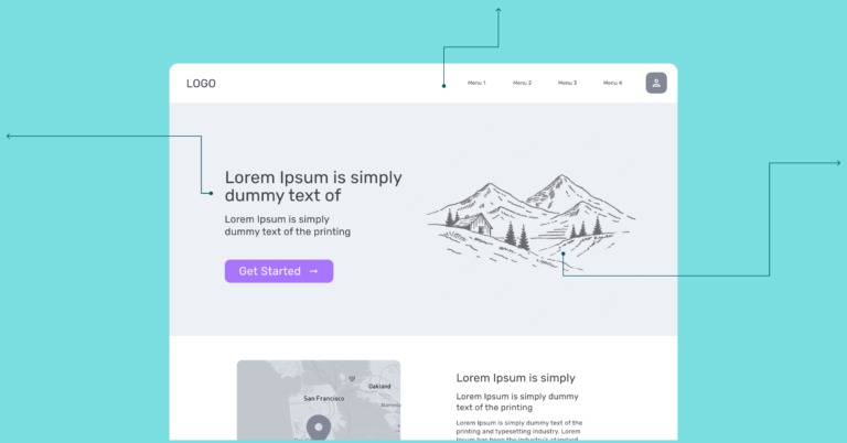
A wireframe is a two-dimensional skeletal outline of your product in the making. This could either be a web landing page or an app. Designers create the initial outlines of the user or buyer’s needs in the form of wireframes to give you a clear overview of how the page will be laid out, the flow of possible design solutions and how that fits into product functionality and user behaviors and experience.
Wireframes could be paper or software-rendered but their purpose is just the same: Assisting you to ideate optimal, user-focused design prototypes for the best possible products.
When do designers create a wireframe?
Every product you build for the web has a product life cycle. Since wireframes lay out the initial drafts of the product design, they are created in the early stages of development, that is when the product is still in its exploratory phase.
This rough architecture is used as a reference point for further design sprints. We call this phase-1 of the design process.
The next phase includes collaborating on initial ideas with your team and gathering feedback before moving to the final step, which is building a more detailed iteration or a high fidelity prototype.
Why is it important to create a wireframe?
Wireframes are more than just a skeletal structure of your product. They reflect how experimental solutions would flow for your intended users. And they also help in identifying product features. Too complicated? Let’s break down both these intentions for you.
User-focused hustle: From a business perspective, every feat on the internet is for your target users. You want them to communicate with your product and pass through a customer journey to successfully do business with you.
But you need to create a dummy experience to realize what your user’s journey will look like. Wireframes help you facilitate feedback from your users. As you brainstorm the initial ideas, you generate more feasible solutions focusing on your users. For instance, you’d realize to do the navigation a bit differently or increase or decrease the size of the hero image.
In the early stages, wireframes help with user testing and let designers collect feedback, brainstorm better ideas, and identify users’ key pain points.
Feature identification: Visualizing a finished landing page or an app is one thing, but seeing how the initial ideas look on paper helps you and your team understand the product features better.
Wireframes build your initial expectation of how the final page will look like, where different product features will live and how tedious or easy the end-user experience will be.
The other thing about wireframing is pinning down exact buttons and design components. For instance, while working with cross-functional teams, your colleagues might not understand when you mention a call-to-action button. By showing them the wireframe, you can help them provide a clear understanding of these elements and how they fit into play.
Different types of wireframes
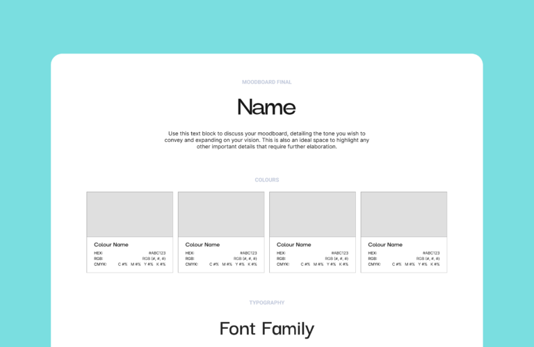
| Low | Mid | High |
You must have come across terms such as low-fidelity or high-fidelity wireframes. They only differ in terms of the design details they carry, like for instance, high-fidelity ones will include pixel-specific layouts and actual feature images that will appear in the final version. Let’s break the difference a bit more in detail:
| Low-fidelity |
|
| Mid-fidelity |
|
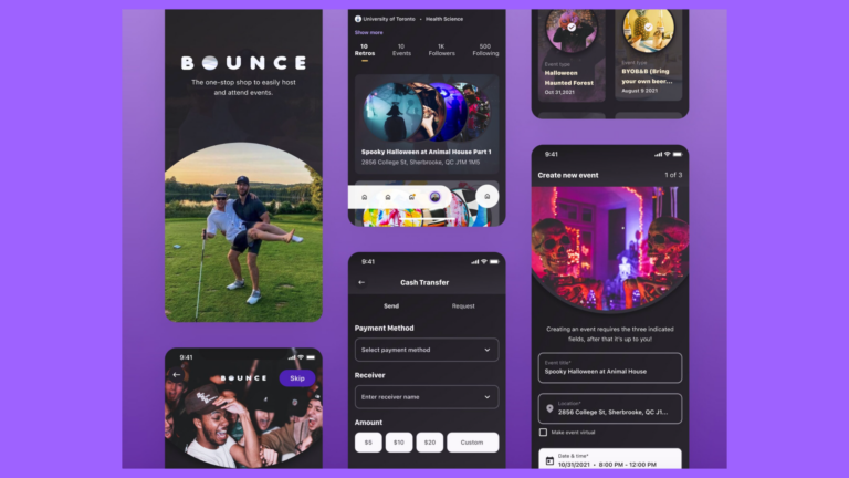
| High-fidelity |
|
What features are included in a wireframe?
Wireframes exhibit some of the most basic design elements like logos, page headers, search fields, call-to-action buttons and dummy text. Depending on what kind of wireframe you create, design elements will vary. For instance, high-fidelity ones contain navigation systems, forms, content drafts etc. They also constrain typography and imagery details and establish an understandable information hierarchy of the product design.
Designers use grayscale and various shades of grey to represent colours. High-fidelity wireframes also contain colours to indicate something specific such as a hyperlink.
As wireframes are two-dimensional, they do not exhibit interactive features of the interface. For instance, you wouldn’t be able to display drop-downs, or accordions for show-hide functionality.
Tools and the process
Thanks to all the new and upcoming design tools, designers can come up with beautiful versions that help us get a more in-depth understanding of the product.
At Produktiv, our designers use Figma, which has preloaded templates. Even novice professionals can get a jumpstart on Figma, mainly because it is easy and adaptable. Also, because it is browser-based, sharing wireframes with our clients is as easy as sharing a link, and one can leave comments on the file to collect feedback and field questions. Other such interesting tools include Sketch and Balsamiq.
Wireframe Best Practices
- Keep your focus on functionality, accessibility and layout during the initial stages of development.
- Establish a structural hierarchy early on to categorize information.
- Divide the screen into blocks and edit them with different sections for links, images and placeholders.
- Make use of annotations for better and clear understanding.
- Consider a mobile-first approach for designing for smaller screens.
- Keep it concise and simple.
- Leave out the nice-to-have features and other finer details unless it is a high fidelity design.
Produktiv wireframe examples
Check out some of the below examples to get inspired for your next project.
Download our UI Wireframe Kit
Need further direction? Get our ready-to-go Figma Wireframe UI Kit to build your prototype fast and easy. It contains all the elements you need to easily construct and customize your product design.


